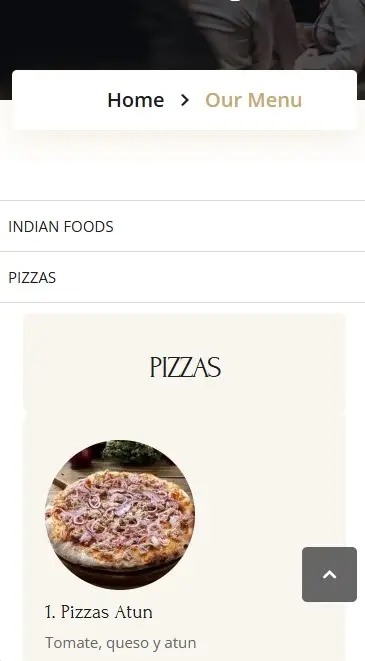
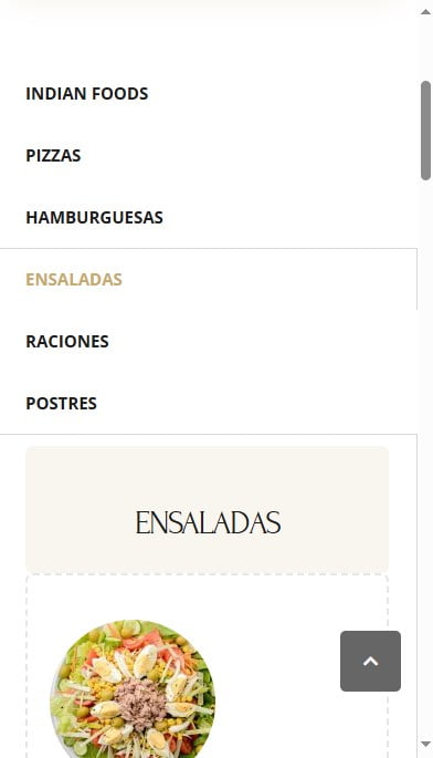
Elementor is a top choice for WordPress users, especially when it comes to designing dynamic layouts. However, a common issue arises when using Elementor’s tab widget on mobile devices: the tabs convert into an accordion layout by default, pushing the tab titles below the content. This layout requires users to scroll through the tab content to find other tab titles, leading to a less intuitive navigation experience.
Fortunately, there’s a simple fix. By using custom CSS and applying the Flexbox model, you can keep Elementor tabs on top on mobile, just as they appear on desktops. In this guide, we’ll walk you through how to do it.
The Problem: Tabs Becoming Accordions on Mobile Devices
Elementor’s default behavior is to adjust its layout based on the screen size. When viewing tabs on a mobile device, instead of maintaining the desktop-style tab navigation, Elementor converts the tabs into an accordion. Here’s why this can be problematic:
- Navigation Frustration: Users must scroll through all the content of the first tab before seeing the other tabs.
- Hidden Content: The accordion layout hides other tabs from immediate view, reducing engagement with additional content.
- Inconsistent Experience: The user experience differs greatly between desktop and mobile views, which can confuse visitors.
For website owners who want a consistent layout and a better user experience, keeping the tab titles visible on top, even on mobile, is essential. This can be easily achieved with custom CSS.

Solution: Custom CSS to Keep Elementor Tabs on Top on Mobile
The following custom CSS uses Flexbox to keep the tab titles visible on top, even on smaller screens. Here’s the code you need to add:
@media (max-width: 767px) {
    /* Keep tab titles on top using Flexbox */
    .elementor-tabs .elementor-tabs-wrapper {
        display: flex;
        flex-wrap: wrap;
        flex-direction: column;
    }

    /* Hide the mobile-specific tab titles */
    .elementor-widget-tabs .elementor-tab-mobile-title {
        display: none;
    }
}
How to Apply This CSS Code:
- Open Elementor Editor:
- Navigate to the page that contains the tab widget you want to modify.
- Click Edit with Elementor.
- Access Custom CSS:
- Select the tab widget (or the container holding the tabs).
- Scroll down to find the Custom CSS section. This is available in Elementor Pro.
- Add the CSS Code:
- Copy and paste the CSS code provided above into the Custom CSS field.
- Preview and Save:
- Use Elementor’s responsive preview feature or check the layout on a mobile device to confirm that the tabs stay on top.
- Once confirmed, click Update to save your changes.

How the CSS Works
- Flexbox for Vertical Layout:
Thedisplay: flexproperty allows the tab titles and content to stay in a flexible container that maintains the tab titles at the top. Theflex-direction: columnproperty ensures that the tabs stack vertically. - Hide Mobile Titles:
Elementor adds mobile-specific titles to each tab, which are unnecessary when we’re using the original desktop-style titles. We usedisplay: noneto hide these mobile titles. - Mobile-Only Targeting:
This custom CSS only applies to devices with a screen width of 767px or less, so the tab layout on larger screens remains unaffected.
Why This Solution Improves User Experience
- Consistent Layout Across Devices:
By keeping the tabs visible on top, users on mobile devices can navigate the content just as they would on a desktop, creating a familiar and consistent experience. - Improved Navigation:
Visitors can easily switch between tabs without scrolling through long pieces of content. This quick navigation makes exploring the site more user-friendly. - Increased Engagement:
Visible tabs encourage users to explore more of the content, which can lead to higher engagement and more time spent on your site.
Can You Further Style the Tabs After Applying This CSS?
Yes, once you’ve applied this CSS, you can continue to customize the appearance of your tabs to match your website’s design. Adjust padding, margins, colors, and fonts to ensure the tabs fit seamlessly within your overall site theme. Additionally, using Elementor’s Advanced settings, you can control responsive padding and margins to make sure the tabs look perfect on every screen size.
Frequently Asked Questions
How do I stop Elementor tabs from turning into accordions on mobile?
To prevent Elementor tabs from converting into an accordion layout, you can use custom CSS to keep the tab titles visible on top. The CSS code provided above achieves this by using Flexbox.
Is this CSS compatible with all mobile devices?
Yes, the custom CSS works on all modern mobile devices, as it is based on media queries that target devices with a screen width of 767px or less.
Does this solution require Elementor Pro?
Yes, Elementor Pro is required to access the Custom CSS section within the Elementor editor. If you’re using the free version, you can apply the CSS directly to your theme or use a child theme’s stylesheet.
Will this CSS affect the desktop layout?
No, the provided CSS is wrapped in a media query that only applies to screens 767px wide or smaller. The desktop layout will remain unchanged.
Can I further customize the look of the tabs after applying this CSS?
Absolutely. You can add more custom CSS to modify the appearance of the tabs, including colors, fonts, padding, and more, ensuring they align with your website’s branding.
Conclusion
If you’re looking for a way to keep Elementor tabs on top on mobile, custom CSS provides a simple and effective solution. By applying the Flexbox model, you can maintain a consistent layout across all devices, improve navigation, and boost user engagement. This small change can make a big difference in your mobile user experience, ensuring that visitors can easily access and explore all your content without unnecessary scrolling.
Learning Sources:


